
//OVERVIEW
Turning a Complex App Builder Into a Product People Understand in Seconds
We turned Intersect’s complex workflow into a clear product story across 10+ sections, 20+ custom components, and 3 core product pillars. This is an ongoing project. New results and updates will be added as we continue to build.
Client:
Intersect
Timeline:
2-3 Weeks
Industry:
Developer-tool
B2C
SaaS
Scope of work:
Landing Page design, Framer Dev and MVP

Review Coming Soon...
//The Outcome
A Clearer Product Experience Built to Make Intersect Easier to Understand
The final experience gave Intersect a stronger product story, a consistent visual system, and a landing page that makes a complex technical product easier to understand and explore.
Built a complete product experience from hero to pricing, testimonials, FAQ, and final CTA.
Designed reusable UI components and product visuals to keep the experience consistent and scalable.
Clearly communicated Intersect’s core flow: Connect Pages → Add Actions → Connect APIs.
Created a unified system across typography, color, UI, illustrations, icons, spacing, and brand elements.
//The Challenge
Simplifying a Complex Product Without Losing What Made Intersect Powerful
Intersect had a powerful idea: simplify web app development by connecting pages, actions, and APIs in one visual workflow. The challenge was to make that value clear at a glance without overwhelming users with technical complexity.
Intersect connects pages, actions, and APIs, but explaining how those pieces work together can quickly become technical and difficult to follow.
The product's core benefit, building web apps faster, wasn't immediately obvious from the experience.
Intersect has multiple capabilities and use cases. The challenge was deciding what to communicate first without overwhelming visitors with information.
As a new app-building platform, Intersect needed to clearly communicate why its visual approach was different from traditional development tools and other app builders.


//The Goal
Make Intersect Easy to Understand, Explore, and Trust From the First Visit
We aimed to turn Intersect’s complex product into a clear, engaging experience that quickly communicates its value, explains how it works, and gives users a reason to explore the product. We also wanted the experience to feel credible and polished enough to position Intersect as a serious product for fast-moving teams.
Show how Intersect works without overwhelming users.
Make Intersect’s value and difference instantly clear.
Make the product feel polished, credible, and ready to use.

//The Approach
Simplifying the Product Story Around How People Actually Understand It
We structured Intersect around a simple flow: show the problem, explain the approach, demonstrate the product, and guide users toward action. Every section was designed to reduce complexity while keeping the product’s capabilities clear and easy to explore.
Strip away unnecessary technical details and make Intersect’s core value clear from the first interaction.
Use the product itself to visually explain how pages, actions, and APIs connect and work together.
Structure the experience around a clear path from understanding the product to exploring it, building with it, and getting started.

//Design Details
Building a Consistent Visual System for Every Part of Intersect
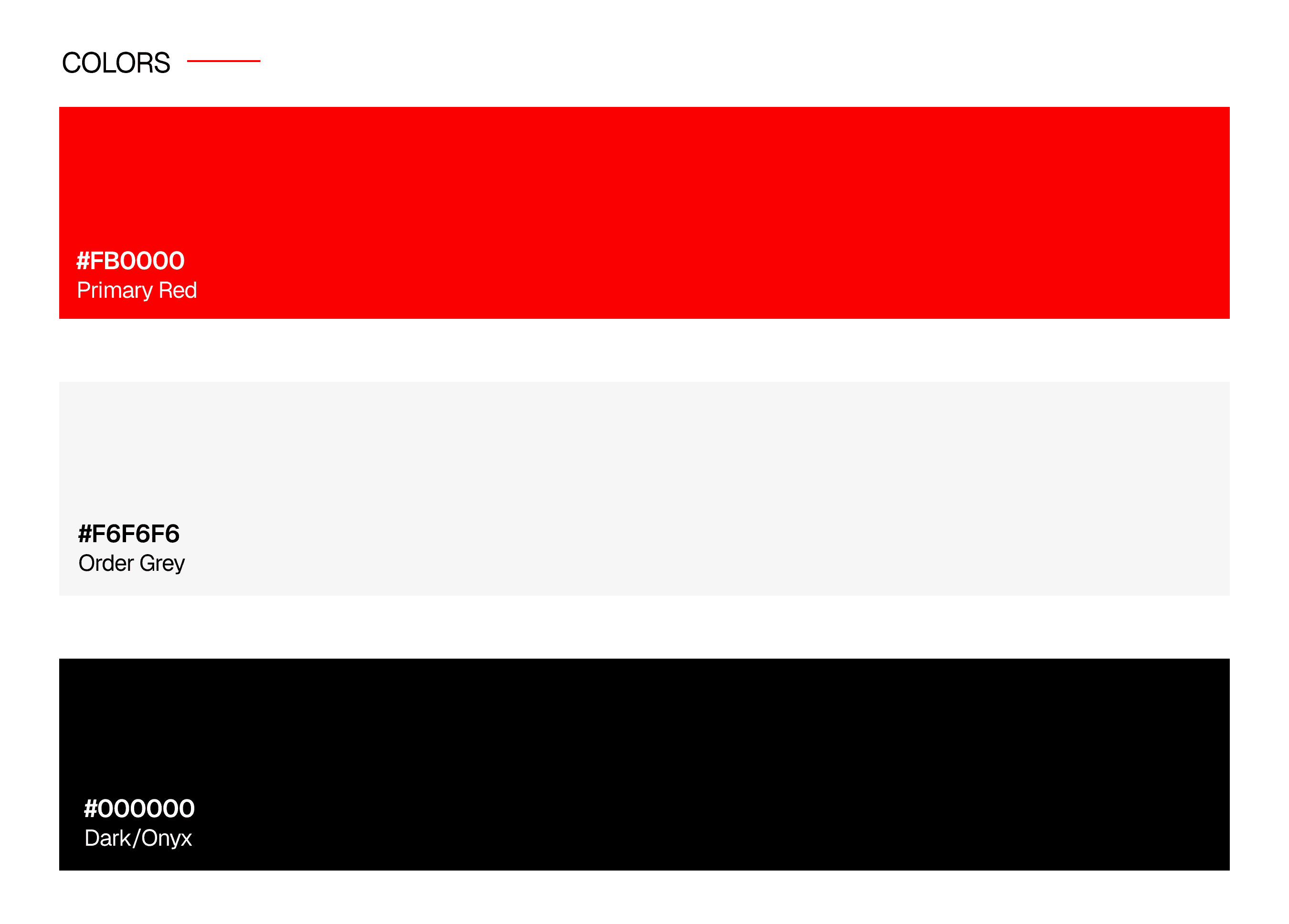
We built a cohesive design system covering typography, colors, UI components, spacing, icons, and visual elements to keep the entire product experience consistent, polished, and easy to scale.



//The Work
Structure the experience around a clear path from understanding the product to exploring it, building with it, and getting started.
We brought the strategy to life through a focused landing page that explains Intersect clearly, showcases how the product works, and gives every part of the experience a clear purpose.


A Landing Page Built to Make a Complex Product Feel Simple
We designed the experience around a clear narrative, using visual storytelling, custom UI, and focused messaging to explain how Intersect works without overwhelming users.


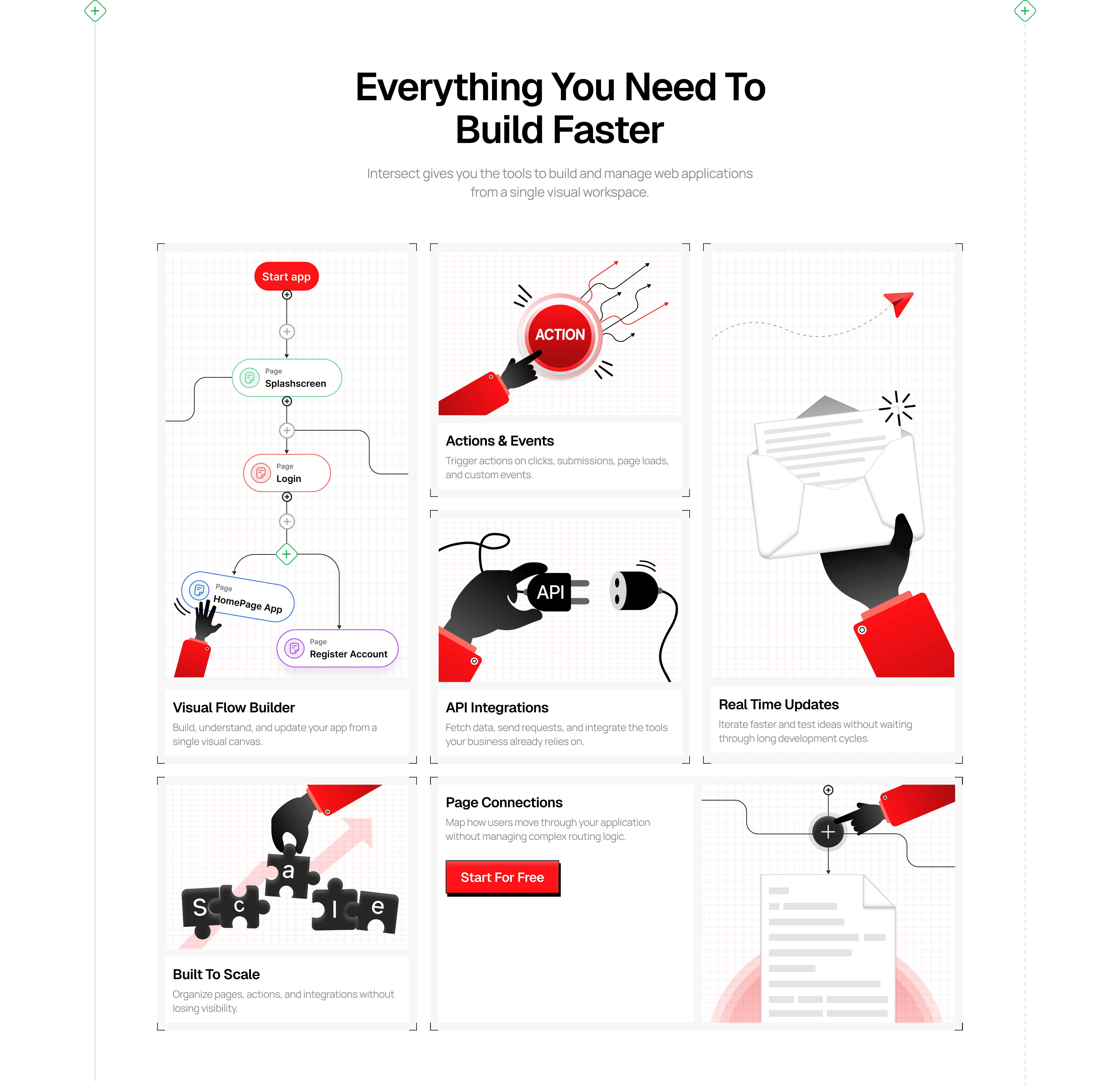
A Visual System Designed to Make Every Part of Intersect Easy to Explore
We created custom UI, illustrations, and interactive sections to turn complex product features into simple, engaging visuals that help users understand the product faster.
You scrolled this far.
Your product deserves people who care about it.
Tell us your story and we'll find out what your product actually needs.
© 2026 Asend.design · All rights reserved.