
//OVERVIEW
2,000+ Monthly Users and Counting. And It All Started With Rebuilding the Landing Page.
HuddleMate had a powerful product but a landing page that wasn't converting. We came in, rebuilt everything from scratch, and gave them the positioning, copy, and content strategy they needed to compete in one of AI's most crowded markets. The result speaks for itself.
Client:
HuddleMate.ai
Timeline:
4 weeks
Industry:
AI Product
B2C
SaaS
Scope of work:
Full Website Redesign + Dev

I highly recommend Saurabh to anyone looking for a great landing page and he is easy to work with.

Arun Bhandari
Founder of HuddleMate.ai
//The Outcome
HuddleMate went from an unclear product in a crowded market to a brand with 2,000+ monthly users that visitors actually understand, trust, and sign up for.
The numbers tell part of the story. The positioning tells the rest.
The new page gives visitors a reason to stay and sign up within the first scroll.
Every page built with a specific visitor and a specific intent in mind.
Every element built from scratch. No templates, no shortcuts.
Visitors understand what it does and why it is different before they reach the bottom.
//The Challenge
HuddleMate is a product worth talking about. The problem was nobody could tell what it actually does.
Competing in one of the fastest growing AI markets without a clear message, strong positioning, or content that converted visitors into users.
HuddleMate had real differentiators but the landing page treated them like every other AI meeting tool. Nothing stood out. Nothing made visitors stop and think "this is different."
The existing copy was vague, generic, and failed to communicate what made HuddleMate uniquely valuable. Visitors landed, read nothing compelling, and left.
Five well funded competitors with bigger audiences, more reviews, and stronger brand recognition were dominating the space. HuddleMate needed to win on clarity and positioning, not budget.
No blog. No comparison pages. No SEO driven content pulling in high intent visitors. The product had no long term system for attracting and converting the right audience organically.


//The Goal
Make HuddleMate impossible to ignore. Anyone who lands on the page should understand what it does within 5 seconds.
The goal wasn't just a better looking landing page. It was building a complete system that clearly communicated what HuddleMate does, why it's different, and why the right user should sign up today.
Any visitor landing on the page should know exactly what HuddleMate does and why they need it within the first 5 seconds.
Build a landing page structure and copy strategy focused on one thing above everything else turning visitors into free trial signups.
Clearly differentiate HuddleMate from 5 major competitors and give it a brand voice strong enough to stand out without a massive marketing budget.


//The Approach
Before writing a single word, we needed to understand the market, the competitors, and the exact person HuddleMate was built for.
We started with the market, not the product. Understanding who HuddleMate was competing against told us exactly what the page needed to say and what it needed to stop saying.
Five competitors analyzed. Their gaps became HuddleMate's positioning.
Every section placed based on where visitor trust was at that point in the scroll.
Every page written, five competitor comparison pages built with clear intent.

//Design Details
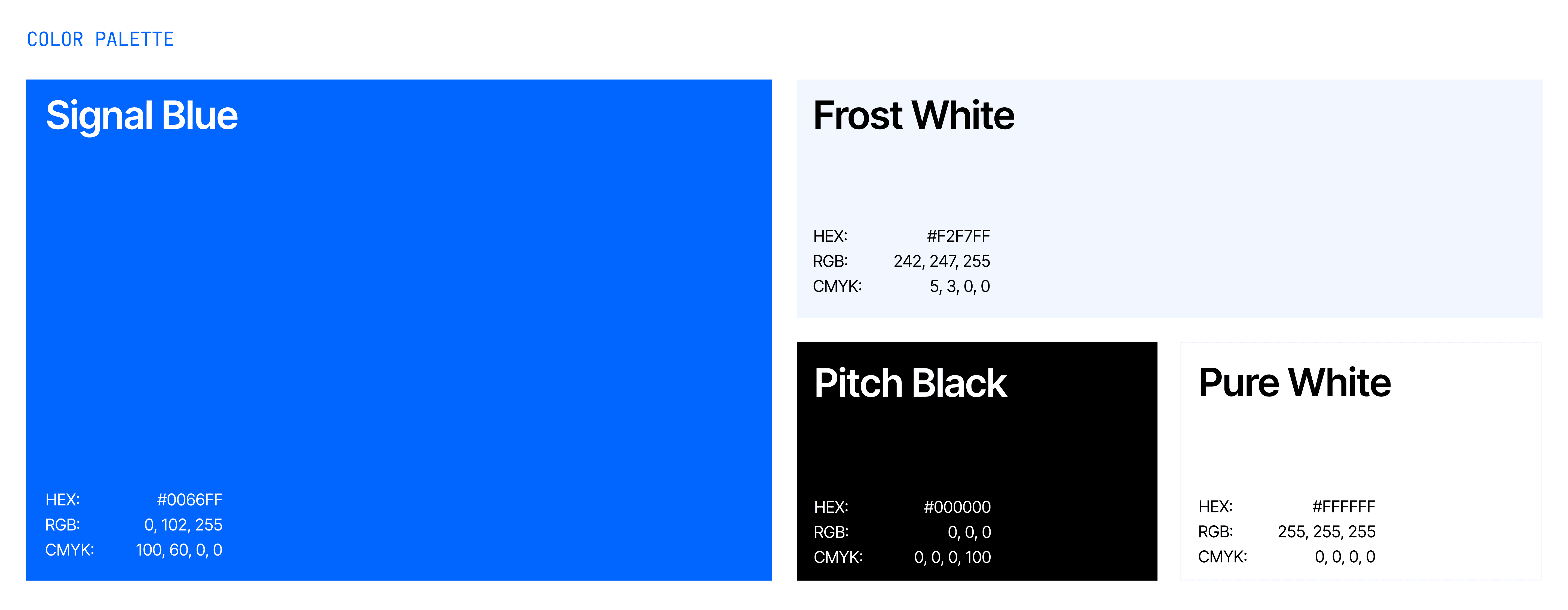
When your product sits invisibly inside someone's most important professional moments, the design cannot afford to feel cheap, rushed, or generic.
Every visual choice was made with one thing in mind. The person using this product is under pressure and the design should never add to it.


//The Work
We started with the hardest part. Making the product instantly understood.
Make anyone who landed on the page immediately understand what HuddleMate does and why it matters to them personally.


Then we built the case for why HuddleMate wins.
Every section that followed was designed to answer the next logical question a visitor would have. Features, comparisons, pricing, and proof placed exactly where trust needed reinforcing.


By the time visitors reached the bottom, the decision was already made.
The final CTA wasn't doing the heavy lifting. Every section before it was. The page was built so that signing up felt like the only natural next step.
You scrolled this far.
Your product deserves people who care about it.
Tell us your story and we'll find out what your product actually needs.
© 2026 Asend.design · All rights reserved.